

Order in chaos.
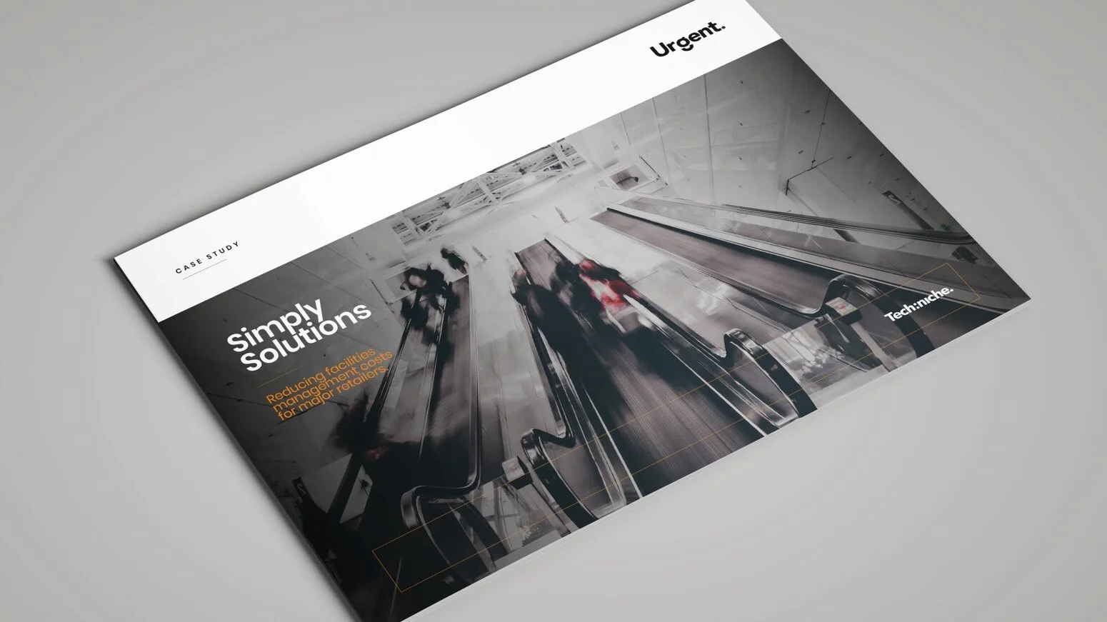
Re-brand and positioning for bespoke facilities management software provider Urgent. Modern and dynamic the re-brand uses fluid abstract colours to represent complexity and change. This was juxtaposed by the ‘brutal simplicity’ of the Urgent logo, graphically representing stability, control and seamless integration.
What we did.
Brand Audit
Brand Architecture
Creative Strategy
Ideation
Brand Positioning
Tone of Voice
Visual Library
Copywriting
Brand World
Brand Book
Brand Guidelines
Art Direction
Design & Artwork
Online & Offline Campaigns


Todays Facilities Managers have strategic goals high on their agenda, we created Urgent’s overall positioning to reflect this.
Control today. Shape tomorrow.


